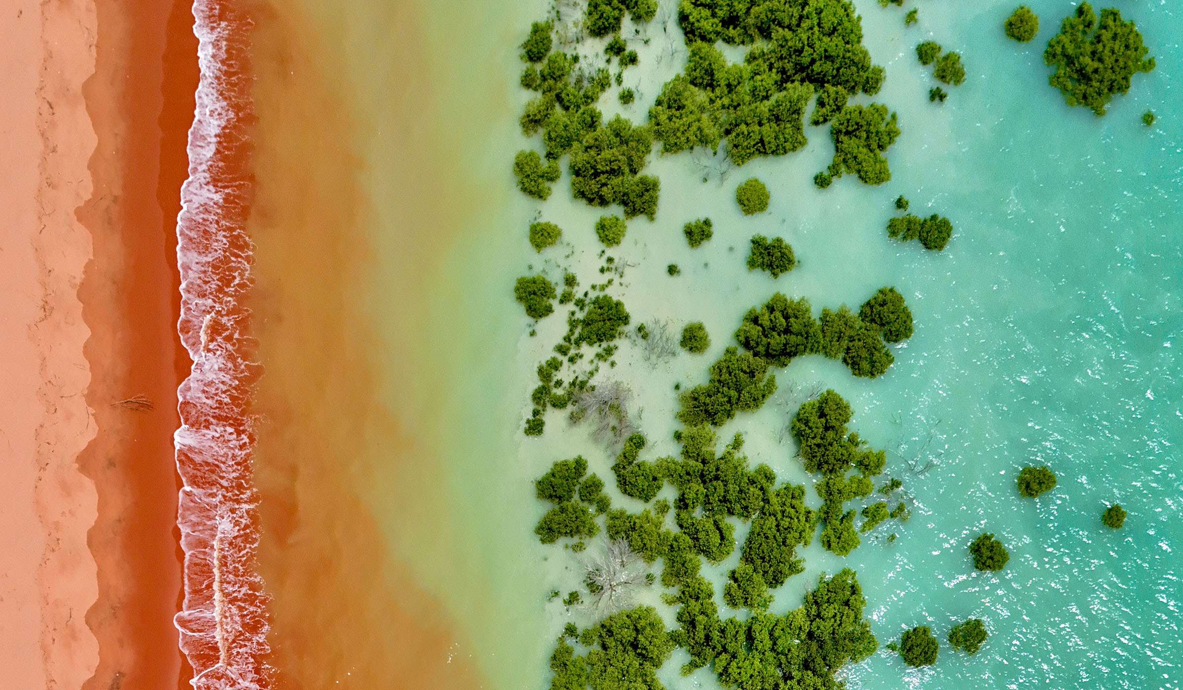
There is a specific quality of light on the WA coast in the afternoon that does not exist anywhere else. It comes from the angle of the sun at this latitude, the iron oxide in the red sandstone, the way the water refracts against a shallow, tide-carved bay. You cannot replicate it in a studio. You can only go there and see it.
This photograph was taken from above Roebuck Bay, Broome, during the dry season. From the ground you see the colours separately - the red sand, the green fringe of mangroves, the turquoise of the bay. From the air you see what they are doing together. Three distinct colour fields meeting at precise, unhesitating edges. No blending. No compromise. Each one fully itself.
That is what the Ondra palette is built from. Not approximations of Australian colour, but the actual colours. The geological, botanical, and tidal facts of this coastline, named precisely and used without apology.
The colours in this photograph
The red-pink of the sand is Pindan - iron oxide deposited over millennia in the sandstone formations that define the Kimberley coast. It is not coral, not terracotta, not salmon. It is the specific red of this specific place. The hex value is #C1420E and it does not need to be anything else.
The water is somewhere between Shallows and Bay - the turquoise of a tidal flat at noon, shifting toward the deeper cobalt where the water deepens toward the channel. These two colours are never far from each other in the palette because they are never far from each other at the coast.
The mangroves are Uguisu - a Japanese colour name meaning bush warbler green, the olive-green that sits between yellow and green without committing to either. It is the same green that appears in the coastal vegetation of northern Australia, in the dense canopy of the mangrove systems that define the tidal margins of every bay from Broome to Darwin.
Why this matters for the work
Ondra is not inspired by the Australian coast in the way that brands are usually inspired by places - as a mood, as an atmosphere, as a lifestyle reference. The palette is the coast. The colours are derived from the actual geological and biological facts of specific places, named from the things that made them.
When you own something in Pindan, you own something the colour of the sandstone at Roebuck Bay at low tide. That is a real thing. It has a location, a geology, a history. The colour is not approximate. It is not decorative. It is a record.
This photograph lives at the start of every conversation about what Ondra is, because it shows the argument more clearly than any explanation. Australian colour is not subtle. It is not muted. It does not need to be softened for a global market. It is already perfect.
Everything arrives in waves. This is where the waves come from.